Recently, I decided to design a hackathon from A to Z.
Besides creating the stages themselves (which I will delve into in another blog post, I hope), I couldn’t find any open source software to manage the hackathon itself (which will be discussed, you guessed it, in yet another blog post).
I decided to use the amazing library react-alert, which comes with a few built in themes for displaying notifications.
I tried to use the basic template, but it doesn’t have a typing declaration module necessary for Typescript 🥲
But one of them is named quite promisingly react-alert-template-mui!
… Yet it uses the dialog component from react material-ui, which is quite obtrusive. Behold:

So what’s more natural than to create a new material template, and to base it upon snackbars?
I’ve started with creating a new react app, and installing material-ui and react-alert.
Surprise!
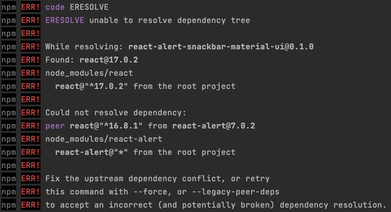 We need to use
 npm i react-alert --force. Oh well…
🛠 Starting from a similiar code to the dialog component, but with snackbar:
1
2
3
4
5
6
7
8
9
10
11
12
13
14
15
16
17
18
19
20
21
22
23
24
25
26
27
28
import React from "react";
import Snackbar from "@material-ui/core/Snackbar";
import Button from "@material-ui/core/Button";
import {AlertComponentPropsWithStyle} from "react-alert";
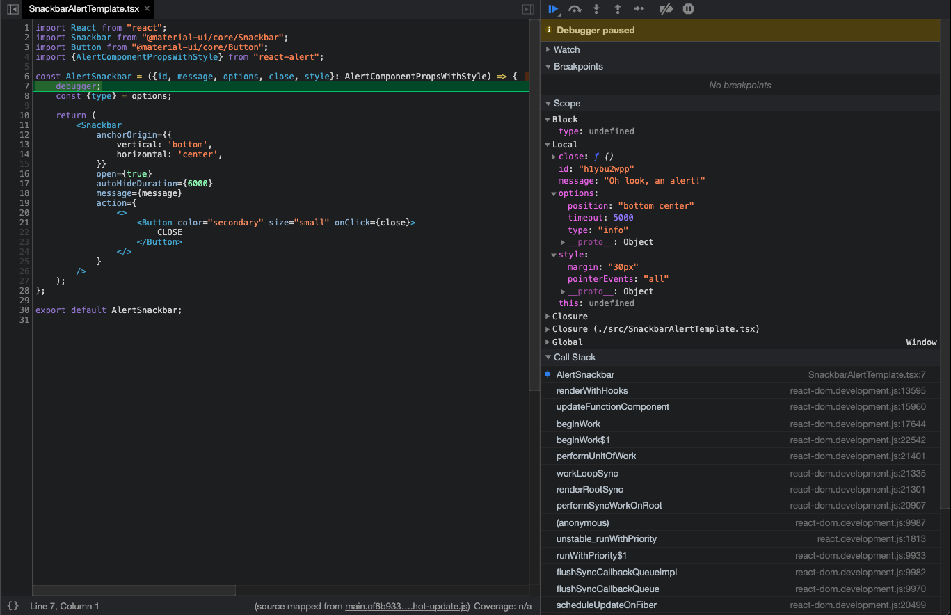
const AlertSnackbar = ({id, message, options, close, style}: AlertComponentPropsWithStyle) => {
debugger;
const {type} = options;
return (
<Snackbar
anchorOrigin={{
vertical: 'bottom',
horizontal: 'center',
}}
open={true}
autoHideDuration={6000}
message={message}
action={
<>
<Button color="secondary" size="small" onClick={close}>
CLOSE
</Button>
</>
}
/>
);
};
Wait! What is a debugger doing there?
Well, I wanted to figure out the options I receive in the component,
and being lazy I chose to use a debugger statement; it could be done cleaner with a breakpoint,
or just by looking at the types (yet in this case there’s a small discrepancy, since the types
don’t mention a position property in options) 🥸
So it turns out the component receives its position, timeout and type in options:
 And from here it’s a matter of a few cuts ‘n pastes to fine tune our component:
1
2
3
4
5
6
7
8
9
10
11
12
13
14
15
16
17
18
19
20
21
22
23
24
25
26
27
28
29
30
31
32
33
34
35
import React from "react";
import Snackbar from "@material-ui/core/Snackbar";
import {AlertComponentPropsWithStyle} from "react-alert";
import MuiAlert, { AlertProps } from '@material-ui/lab/Alert';

function Alert(props: AlertProps) {
  return <MuiAlert elevation={6} variant="filled" {...props} />;
}

const AlertSnackbar = ({message, options, close, style}: AlertComponentPropsWithStyle) => {
    // @ts-ignore
    const {type, timeout, position} = options;
    const anchorOrigin = {
        vertical: position.split(' ')[0],
        horizontal: position.split(' ')[1]
    };

    return (
        <Snackbar
            anchorOrigin={anchorOrigin}
            open
            autoHideDuration={timeout}
            style={{
                ...style,
                minWidth: '30vw'
            }}
        >
            <Alert onClose={close} severity={type}>
                {message}
            </Alert>
        </Snackbar>
    );
};

export default AlertSnackbar;
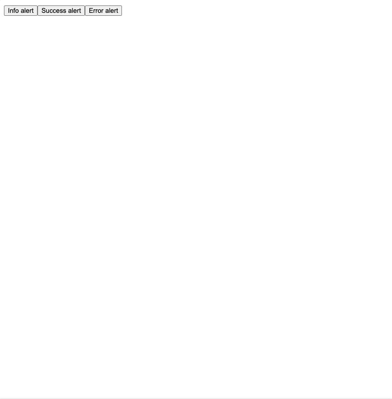
Lo and behold (sped up 2x):
A few remarks for this implementation:
- I used
@ts-ignore. Usually, this is a major warning sign, but I did this in order to bypass some typing definitions. - The alert itself does not dismiss when a new one appears.
- The animation effect renders twice (resulting in a slight jittery animation), because of hooks change.
The complete code is available here, and the npm package is available here.
I uploaded the package to npm using np; note that you can use npx np.